The Merrimack Valley is home to one of the largest waterways in New England and a source of industry for centuries. Large industrial mills settled along the river starting in the early 1800s. Daily stage coach runs were made between the Merrimack Valley area and Boston starting as early as 1826. By the mid-nineteenth century, Lowell, Massachusetts was the largest industrial center in the United States.
With a history of big industry and entrepreneurship, the Merrimack Valley has a long history of attracting settlers from around the world: Irish, French-Canadian, Lebanese and Italian populations of the nineteenth and twentieth centuries, to immigrants from the Dominican Republic and other Caribbean nations more recently. The long history of immigration has made the area diverse, colorful, welcoming, and a collage of culture. Today, Lawrence, Massachusetts is proud to be the first Minority Majority City in the U.S. with 80% of the population Latino.
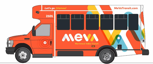
The MeVa brand was designed to reflect the diversity, vibrancy and forward-thinking spirit of the area. The bright vivid colors represent those seen in the building facades of Old San Juan, and those that appeal to a heavily Latino audience with big personalities and optimistic demeanors. The brand was designed to feel uplifting, modern and create a new perception of public transportation in the Merrimack Valley, one that no longer sits in the background but is bold, joyful and eye-catching. From a distance the vehicle fleet cannot be missed. The brand is like no other in the country and uniquely Merrimack Valley.
WHAT IS A BRAND AND WHY IS IT IMPORTANT TO A TRANSIT ORGANIZATION?
BUILDING THE BRAND Branding is far deeper than a logo design. At the core of branding is shaping the perception and experience of the MeVa Transit system. It is the art of building an organization that is beloved by your customers, staff and community stakeholders.
WHO IS MEVA? The first phase of brand building is identifying who you are, how you’re unique, what you value and who you aspire to be as an organization.
These core branding concepts will:
- Shape the personality of the organization
- Help build a cohesive team that is working with passion and purpose
- Attract new riders because they genuinely enjoy riding the system
The branding concepts behind the MeVa brand are outlined in the diagram to the left.
The MeVa Brand


THE FLEET BRANDING The most important element of any transit brand is the design of the system’s fleet. It is the largest expression of a brand and creates the highest visibility for the organization. The design of the fleet should maintain the overall character, proportions and elements as established in this BRT vehicle but the design and layout will be customized to the architecture of each vehicle.
THE INSPIRATION The design of the MeVa fleet is inspired by the arrows of the custom MeVa logotype. The arrows represent the concept of moving the region forward with color, vibrancy and a modern flair. The design and colors represent those inspired by the bright, lively facades of Old San Juan and those that resonate with a heavily Latino audience. Subtle ripples appear around the MV monogram and the active ADA symbol, bringing attention to these details. The ripples represent the water of the Merrimack River that connects the MeVa service area. On the back of the vehicles are clock faces subtly integrated into the design. This element represents the historic architecture and the famous clocks of the region.
THE TRANSFORMATION